Just when we thought we got a grip on Mobile Apps, Mobile (M-dot) Sites and Responsive Web Design (RWD) another acronym started to pop up: Adaptive Web Design (AWD).
Let’s look at the definitions of the various approaches:
A Mobile App is a computer program designed to run on smartphones, tablet  computers and other mobile devices. This one is pretty straight forward.
An M-dot Site is website specifically made for mobile devices. It has a different user interface and size than the regular desktop website, and typically stripped down content. Specific code determines whether the requesting device is a mobile or desktop device and serves either the mobile or desktop site to the end-user.
The picture on the left shows the “old” MMDbiz mobile (M-dot) site compared to the “old” full site (shown below) to give you an idea.

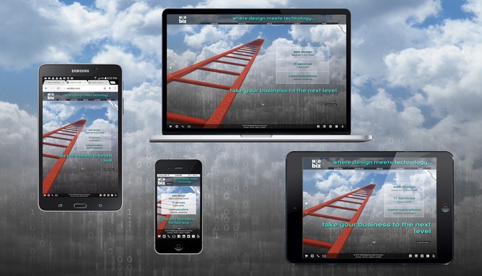
Responsive Web Design (RWD) is an approach to web design aimed at crafting sites to provide an optimal viewing experience—easy reading and navigation with no resizing, panning, and minimal scrolling—across a wide range of devices (from desktop computer monitors to mobile phones).
A responsive site adapts to any screen size or device regardless of size, make or model. See the picture below that shows the mmdbiz.com site on various devices.
Adaptive Web Design (AWD), strives to optimally deliver and display pages for any combination of location, device and network capability. This concept allows for better performance on mobile devices while maintaining visual consistency between the mobile and desktop sites. Server side scripts determine the client device type and capabilities and serve optimized content.
AWD is complex and typically only large companies can tackle this successfully. Sites that are using adaptive technology are Amazon and USA Today for example. Similar to the M-dot site, AWD needs to be updated constantly with every new device/browser in order to be effective.
Conclusion
A well designed and optimized Responsive Web Site fits the bill for most companies. Slow performance on mobile devices is often cited as drawback for responsive sites. However, there are numerous techniques to improve mobile performance:
- Serve smaller graphics (which are typically the main culprits) to mobile devices versus desktop sites.
- Optimize images
- Use compression on the web server
- Minify all CSS and JavaScript
- Combine CSS and JavaScript files into single files for production
- Leverage browser cashing
With RWD only one site needs to be maintained which translates to lower maintenance costs.
RWD is one of the core competencies of MMDbiz and we have been building responsive sites for several years (see web design portfolio).
Cheers,
Marcel
Marcel Manzardo | President & CEO
MMDesign Business Solutions
phone: 888 885-0205 x400 | fax: 888 422-0186
marcel.manzardo@mmdbiz.com
www.mmdbiz.com