MMD Logo

where design meets technology…

Mobile Ready? – April 21st is the day…

It’s official, as of April 21, 2015 Google will be factoring in mobile-friendliness into its search algorithm.

What that means in plain English is that your website will be ranked lower in mobile search if it is not deemed mobile-friendly.

google
Read Google’s statement

There are several factors that Google takes into consideration when it assesses your site:

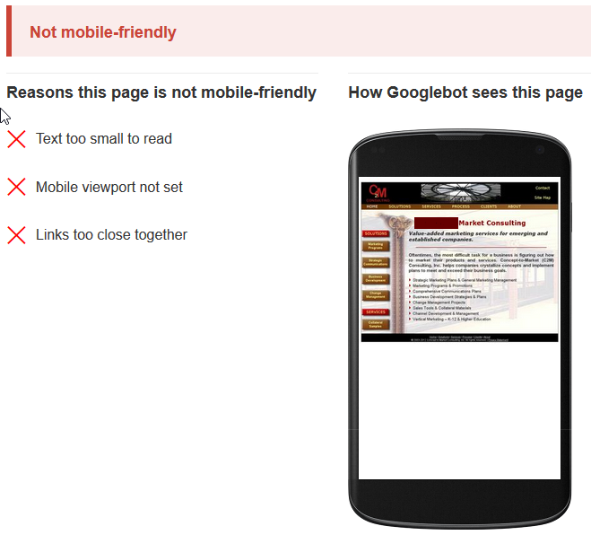
  1. The text needs to be set at a reasonable size on a mobile device such that it is actually readable without zooming in.
  2. The mobile viewport has to be set. To learn more about the viewport settings see here.
  3. Make sure your robots.txt rules do not block JavaScript, CSS, images or any other resources. Otherwise the Google bot will not see your site correctly and not consider it mobile-friendly. Check Google’s recommendations on blocked resources.
  4. The links need to be spaced sufficiently such that they can be tapped by a fat finger. Google actually assesses the actual link spacing and if they are too close will penalize the site.
  5. Stay away from software that is not compatible with mobile devices, e.g. Flash. Almost anything can be achieved with CSS3 and JavaScript, and Flash is clearly obsolete in a mobile dominated world.
  6. The content has to be fitted appropriately such that there is no need to scroll horizontally or zoom. Essentially the content cannot be wider than the screen of the mobile device.


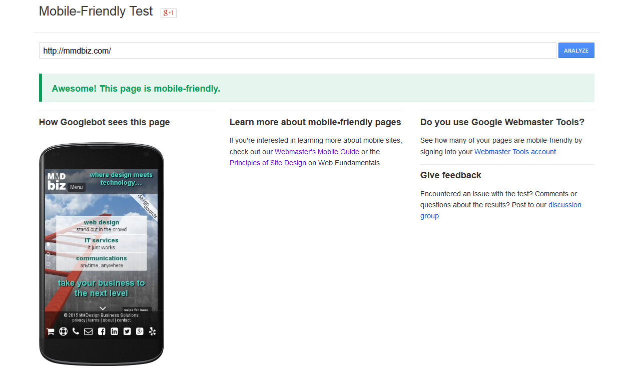
To check your site go to Google’s Mobile-Friendly Test.

The result will be one the of examples shown below.2015-02-22-20_50_48-Mobile-Friendly-Test

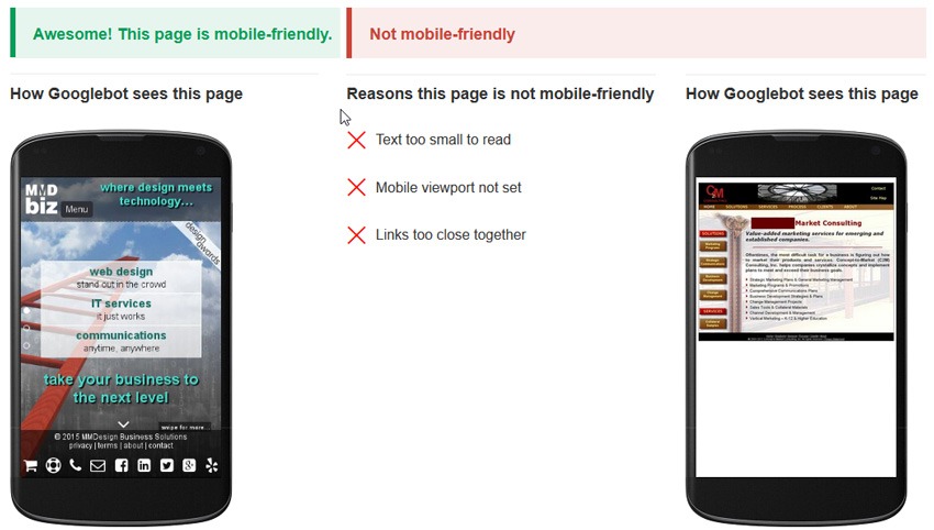
Why should you care about mobile search?

There has been a major paradigm shift to a mobile dominated internet:

  • mobile_vs_desktop_searchMobile search accounts for approximately 50% of all website searches.
  • Smart-phones and tables combined account for 60% of all online traffic (source comScore)
  • 52% of smartphone and tablet users use mobile as their primary internet access device (source Ofcom).

What to do if your site fails the test

Convert your website to a responsive design.

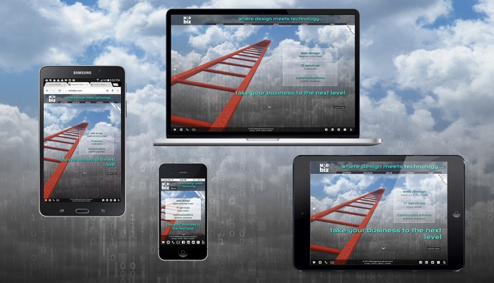
This is one of MMDbiz’s core competencies, and we have been building responsive sites for several years. Please visit our web design portfolio to see our recent work.

Contact us if you have questions.

Happy testing!

Marcel

Adaptive Web Design

Just when we thought we got a grip on Mobile Apps, Mobile (M-dot) Sites and Responsive Web Design (RWD) another acronym started to pop up: Adaptive Web Design (AWD).

Let’s look at the definitions of the various approaches:

A Mobile App is a computer program designed to run on smartphones, tablet Mobile Web Designcomputers and other mobile devices. This one is pretty straight forward.

An M-dot Site is website specifically made for mobile devices. It has a different user interface and size than the regular desktop website, and typically stripped down content. Specific code determines whether the requesting device is a mobile or desktop device and serves either the mobile or desktop site to the end-user.

The picture on the left shows the “old” MMDbiz mobile (M-dot) site compared to the “old” full site (shown below) to give you an idea.


macbookook_screen

Responsive Web Design (RWD) is an approach to web design aimed at crafting sites to provide an optimal viewing experience—easy reading and navigation with no resizing, panning, and minimal scrolling—across a wide range of devices (from desktop computer monitors to mobile phones).

A responsive site adapts to any screen size or device regardless of size, make or model. See the picture below that shows the mmdbiz.com site on various devices.

linkedin_post_image

Adaptive Web Design (AWD), strives to optimally deliver and display pages for any combination of location, device and network capability. This concept allows for better performance on mobile devices while maintaining visual consistency between the mobile and desktop sites. Server side scripts determine the client device type and capabilities and serve optimized content.

AWD is complex and typically only large companies can tackle this successfully. Sites that are using adaptive technology are Amazon and USA Today for example. Similar to the M-dot site, AWD needs to be updated constantly with every new device/browser in order to be effective.

Conclusion
A well designed and optimized Responsive Web Site fits the bill for most companies. Slow performance on mobile devices is often cited as drawback for responsive sites. However, there are numerous techniques to improve mobile performance:

  • Serve smaller graphics (which are typically the main culprits) to mobile devices versus desktop sites.
  • Optimize images
  • Use compression on the web server
  • Minify all CSS and JavaScript
  • Combine CSS and JavaScript files into single files for production
  • Leverage browser cashing

With RWD only one site needs to be maintained which translates to lower maintenance costs.

RWD is one of the core competencies of MMDbiz and we have been building responsive sites for several years (see web design portfolio).

Cheers,

Marcel

Marcel Manzardo | President & CEO
MMDesign Business Solutions
phone: 888 885-0205 x400 | fax: 888 422-0186
marcel.manzardo@mmdbiz.com
www.mmdbiz.com

Is Your Website Passing the Test?

Mobile-friendly testGoogle recently made a tool available to test any website for being “mobile-friendly” (see mobile-friendly test).

Test your site, and if it looks like the image shown on the right, you should take action.

The Mobile User Experience Cannot Be Ignored Anymore.

Mobile search accounts for about 50% of overall search volumemobile_vs_desktop_search

Can your business ignore 50% of all search? I don’t think so…
According to BIA/Kelsey and Google statements, Mobile search will surpass desktop search this year.


Google already penalizes sites that provide a bad experience to mobile searchers. Now the company has confirmed that it’s testing with what seems like a boost for those providing a great experience.
Google also introduced the “mobile-friendly” label in mobile search results.

The Solution – Responsive Design

Responsive Web Design (RWD) has been around for several years now and has become the de facto standard for web design. Google recommends responsive design in their developer help files (see https://developers.google.com/web/fundamentals/layouts/index?hl=en).

  • If done right, responsive design provides the same user experience over all device types (mobile, tablet and desktop).
  • Only a single website has to be maintained unlike with a mobile site and desktop site approach.
  • RWD saves money over the live of a website (only one site to maintain).

I Failed The Test – What Now?

Mobile-Friendly_Test_-_2015-02-22_20.23.49Convert your site to responsive design!
RWD is one of the core competencies of MMDbiz and we have been building responsive site for several years (see web design portfolio).
Ask us for a quote!

If you are already work with a developer, ask to see your developer’s references and portfolio. Make sure he or she understands responsive webdesign and has responsive sites in their portfolio.