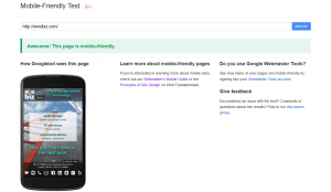
 Google recently made a tool available to test any website for being “mobile-friendly” (see mobile-friendly test).
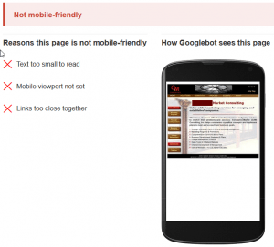
Test your site, and if it looks like the image shown on the right, you should take action.
The Mobile User Experience Cannot Be Ignored Anymore.
Mobile search accounts for about 50% of overall search volume
Can your business ignore 50% of all search? I don’t think so…
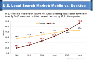
According to BIA/Kelsey and Google statements, Mobile search will surpass desktop search this year.
Google already penalizes sites that provide a bad experience to mobile searchers. Now the company has confirmed that it’s testing with what seems like a boost for those providing a great experience.
Google also introduced the “mobile-friendly” label in mobile search results.
The Solution – Responsive Design
Responsive Web Design (RWD) has been around for several years now and has become the de facto standard for web design. Google recommends responsive design in their developer help files (see https://developers.google.com/web/fundamentals/layouts/index?hl=en).
- If done right, responsive design provides the same user experience over all device types (mobile, tablet and desktop).
- Only a single website has to be maintained unlike with a mobile site and desktop site approach.
- RWD saves money over the live of a website (only one site to maintain).
I Failed The Test – What Now?
 Convert your site to responsive design!
RWD is one of the core competencies of MMDbiz and we have been building responsive site for several years (see web design portfolio).
Ask us for a quote!
If you are already work with a developer, ask to see your developer’s references and portfolio. Make sure he or she understands responsive webdesign and has responsive sites in their portfolio.

