MMD Logo

where design meets technology…

Ultimate Website Check (part 2, Speed)

Laptop with Stethoscope

Speed is King

Website Load Time
Website Load Time in Seconds

Speed is one of the most important metrics for your website. Everybody is in a hurry and according to surveys done by Akamai and Gomez.com, nearly half of web users expect a site to load within 2 seconds or less. 40% of users tend to abandon a site that has not loaded within 3 seconds. Use the Pingdom Website Speed Test for example to evaluate your site. Make sure the load time is below 2 seconds.

Mobile internet users expect browsing on their phones/tablets to be comparable to the desktop or laptop experience.  However, internet speed on mobile devices is typically slower than on desktops and laptops. So page optimization is crucial for being successful in the mobile world.

Speed testFor starters test the speed of your website with Google’s PageSpeed Insights tool. Follow the steps below to improve your site speed. We are starting with the low hanging fruit…

  1. Select the “right” format for your image and compress all images. To learn the basics about image processing and formats read Google’s Image Optimization Guide.
    If you need alpha transparency in your images, save the pictures as PNG 24. You will notice that the image size is really large, typically much bigger than a JPG equivalent. Fortunately there is TinyPNG an excellent tool that compresses PNG files typically by about 70% while preserving alpha transparency.

iphone png 24iphone optimized

Can you tell which picture is 155KB and which is 44KB?

  1. Combine all CSS files into one master CSS file and minimize CSS by using e.g. node.js together with clean-css (see https://www.npmjs.com/package/clean-css). This approach allows you to create a batch file that combines all your CSS files into a compressed single CSS file with a single click.
    You can also just use one of the online tools to combine and compress multiple CSS files.
    Why is it not good enough to just compress the individual CSS files? You could argue that the amount of data that needs to be transferred is the same whether the CSS files are combined or not. The reason for combining the files is to minimize server requests. If you have 10 CSS files versus one, then you just saved 9 requests and they do add up…
  2. Minify your JavaScript files and combine them into a single file. http://jscompress.com/ will do that for you.
  3. Minifying HTML can save you some extra bytes and there are online tools available that take care of CSS, JavaSript and HTML minification. However, for a typical modern page, the actual HTML code is orders of magnitude smaller than the CSS and JavaSript. So if minifying HTML only saves you a couple of hundred bytes don’t bother.
  4. gzip compressionEnable gzip compression on your web server. All modern browsers support and automatically negotiate gzip compression for all HTTP requests. Server side compression gives you the most bang for the buck as it affects all resources that your user needs to download to display a page. However, depending on your web host, you may have to contact them to enable compression. Typically, you can just add directives to your .htaccess file like shown below:
    # compress text, html, javascript, css, xml:
     AddOutputFilterByType DEFLATE text/plain
     AddOutputFilterByType DEFLATE text/html
     AddOutputFilterByType DEFLATE text/xml
     AddOutputFilterByType DEFLATE text/css
     AddOutputFilterByType DEFLATE application/xml
     AddOutputFilterByType DEFLATE application/xhtml+xml
     AddOutputFilterByType DEFLATE application/rss+xml
     AddOutputFilterByType DEFLATE application/javascript
     AddOutputFilterByType DEFLATE application/x-javascript

    This is a nice article that shows you how to set things up. Make sure, you test that compression is working.

  5. Leverage browser caching by setting  a maximum age or expiry date  in the HTTP headers for static resources. This will allow the browser to load previously cached content instead of downloading all resources from your web server. This obviously is only meaningful for “static resources” meaning content that does not change frequently. Typically this can be achieved by adding code similar to what is shown below to your .htaccess file.
     ## EXPIRES CACHING ##
     
     <IfModule mod_expires.c>
     ExpiresActive On
     ExpiresByType image/jpg "access plus 7 days"
     #ExpiresByType image/jpeg "access plus 7 days"
     #ExpiresByType image/gif "access plus 7 days"
     ExpiresByType image/png "access plus 7 days"
     ExpiresByType text/css "access plus 7 days"
     ExpiresByType application/pdf "access plus 1 month"
     ExpiresByType text/x-javascript "access plus 7 days"
     ExpiresByType text/javascript "access plus 7 days"
     ExpiresByType application/x-javascript "access plus 7 days"
     ExpiresByType application/javascript "access plus 7 days"
     #ExpiresByType application/x-shockwave-flash "access plus 7 days"
     #ExpiresByType image/x-icon "access plus 1 month"
     ExpiresDefault "access plus 24 hours"
     </IfModule>
     ## EXPIRES CACHING ##

    If you need more information check the “Leverage Browser Caching” resources at Google.

  6.  Caching in general can greatly improve the speed of your site. This is particularly important if you use a CMS like WordPress, Joomla, Drupal or alike. So if your content does not change on a daily bases, use a caching plugin. An example would be “WP Super Cache” for WordPress. Caching does not only make your site faster it also minimizes server load.
  7. Eliminate render-blocking JavaScript and CSS in above-the-fold content. What this really means is the following: Move all JavaScript that is not required to display the visible part of your page (without scrolling) to the very bottom of the code (before the </body> tag.  Instead of referencing small JavaScripts with a file, inline the actual JavaScript code which will eliminate the request latency. For more details see “Remove Render-Blocking JavaScript“CSS files should be left in the head section (even though they are allowed in HTML5 in the body section) see optimize CSS delivery.
  8. Make sure your web server has a fast response time (under 200ms). Testing your web server requires multiple measurements over several periods of time. Depending on your hosting company, performance data may be available.
    server load
    cPanel Server Load Info

    At least you should be able to see the current load of the server. If you are in shared environment (not a dedicated server) and the load is anywhere near 80-90%, then you better talk to the hosting company so they can move you to a better server…

  9. Avoid web content, such as Flash, Silverlight, and Java. Most mobile devices do not support these plugins and even modern desktop browsers restrict their use. Besides the overhead they are a leading cause of crashes and security issues.
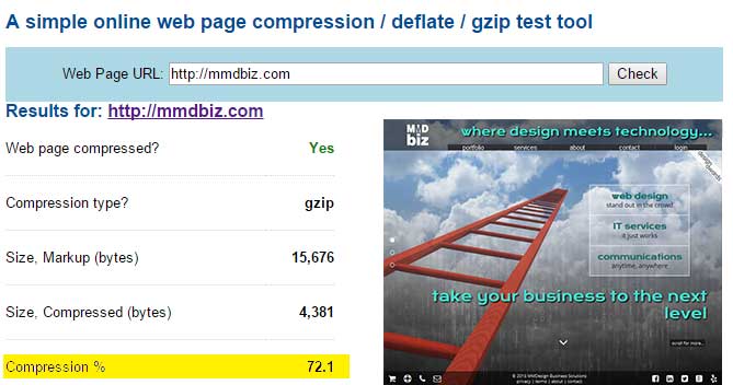
Case in point…
speed test

This is the result of Pingdom Speed Test for MMDbiz. Note that mmdbiz.com loads faster than 98% of all tested web sites.
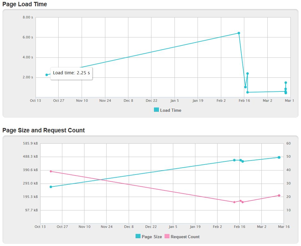
We actually did tests throughout the development of the site: the page size increased and with it the load time. A sharp drop in mid February marks the implementation of the above mentioned speed enhancing measures.

Speed History
History throughout the development of the site

 Part 3 coming soon…

If you have questions, contact us!

Cheers,

Marcel

Marcel Manzardo | President & CEO
MMDesign Business Solutions
phone: 888 885-0205 x400 | fax: 888 422-0186
marcel.manzardo@mmdbiz.com
www.mmdbiz.com

Ultimate Website Check (part 1, Basics & Infrastructure)

web-health-check

Whether you have a highly sophisticated, complex eCommerce website or a simple blog, there are a few things that just have to be done right…

The Basics

Lets look at the basics first; don’t even think about launching a site without having the following covered:

web-basics

Infrastructure

Regularly check your site infrastructure:

  • Make sure your content and page titles are unique (no duplicates). Include your keywords in both title and page content.
  • Validate HTML and eliminate code validaytionerrors. The tool lists errors and warnings that will help you to fix your code. Clean HTML ensures that the bots can successfully crawl your site. Note that the HTML5 validation tool is still in experimental stage. That is the reason why it shows a warning on the mmdbiz.com site when there should be none…
  • Validate your CSS files at http://csslint.net/. Note that bots do crawl CSS files. So valid CSS file will not only display your content correctly but also help SEO.
  • Check your JavaScript; there are numerous online tools available that will check your code. Again, bots do crawl JavaScript files and they should be clean.
  • index_statusMake sure your pages are all indexed by using Webmaster Tools
  • Check for 404 errors with the Google Crawl Errors report in the Webmaster Tools.
  • Check your site speed and address all recommendations.

Ultimate Website Check (part 2, Speed)…

If you have questions, contact us!

Cheers,

Marcel

Marcel Manzardo | President & CEO
MMDesign Business Solutions
phone: 888 885-0205 x400 | fax: 888 422-0186
marcel.manzardo@mmdbiz.com
www.mmdbiz.com

Mobile Ready? – April 21st is the day…

It’s official, as of April 21, 2015 Google will be factoring in mobile-friendliness into its search algorithm.

What that means in plain English is that your website will be ranked lower in mobile search if it is not deemed mobile-friendly.

google
Read Google’s statement

There are several factors that Google takes into consideration when it assesses your site:

  1. The text needs to be set at a reasonable size on a mobile device such that it is actually readable without zooming in.
  2. The mobile viewport has to be set. To learn more about the viewport settings see here.
  3. Make sure your robots.txt rules do not block JavaScript, CSS, images or any other resources. Otherwise the Google bot will not see your site correctly and not consider it mobile-friendly. Check Google’s recommendations on blocked resources.
  4. The links need to be spaced sufficiently such that they can be tapped by a fat finger. Google actually assesses the actual link spacing and if they are too close will penalize the site.
  5. Stay away from software that is not compatible with mobile devices, e.g. Flash. Almost anything can be achieved with CSS3 and JavaScript, and Flash is clearly obsolete in a mobile dominated world.
  6. The content has to be fitted appropriately such that there is no need to scroll horizontally or zoom. Essentially the content cannot be wider than the screen of the mobile device.


To check your site go to Google’s Mobile-Friendly Test.

The result will be one the of examples shown below.2015-02-22-20_50_48-Mobile-Friendly-Test

Why should you care about mobile search?

There has been a major paradigm shift to a mobile dominated internet:

  • mobile_vs_desktop_searchMobile search accounts for approximately 50% of all website searches.
  • Smart-phones and tables combined account for 60% of all online traffic (source comScore)
  • 52% of smartphone and tablet users use mobile as their primary internet access device (source Ofcom).

What to do if your site fails the test

Convert your website to a responsive design.

This is one of MMDbiz’s core competencies, and we have been building responsive sites for several years. Please visit our web design portfolio to see our recent work.

Contact us if you have questions.

Happy testing!

Marcel

Adaptive Web Design

Just when we thought we got a grip on Mobile Apps, Mobile (M-dot) Sites and Responsive Web Design (RWD) another acronym started to pop up: Adaptive Web Design (AWD).

Let’s look at the definitions of the various approaches:

A Mobile App is a computer program designed to run on smartphones, tablet Mobile Web Designcomputers and other mobile devices. This one is pretty straight forward.

An M-dot Site is website specifically made for mobile devices. It has a different user interface and size than the regular desktop website, and typically stripped down content. Specific code determines whether the requesting device is a mobile or desktop device and serves either the mobile or desktop site to the end-user.

The picture on the left shows the “old” MMDbiz mobile (M-dot) site compared to the “old” full site (shown below) to give you an idea.


macbookook_screen

Responsive Web Design (RWD) is an approach to web design aimed at crafting sites to provide an optimal viewing experience—easy reading and navigation with no resizing, panning, and minimal scrolling—across a wide range of devices (from desktop computer monitors to mobile phones).

A responsive site adapts to any screen size or device regardless of size, make or model. See the picture below that shows the mmdbiz.com site on various devices.

linkedin_post_image

Adaptive Web Design (AWD), strives to optimally deliver and display pages for any combination of location, device and network capability. This concept allows for better performance on mobile devices while maintaining visual consistency between the mobile and desktop sites. Server side scripts determine the client device type and capabilities and serve optimized content.

AWD is complex and typically only large companies can tackle this successfully. Sites that are using adaptive technology are Amazon and USA Today for example. Similar to the M-dot site, AWD needs to be updated constantly with every new device/browser in order to be effective.

Conclusion
A well designed and optimized Responsive Web Site fits the bill for most companies. Slow performance on mobile devices is often cited as drawback for responsive sites. However, there are numerous techniques to improve mobile performance:

  • Serve smaller graphics (which are typically the main culprits) to mobile devices versus desktop sites.
  • Optimize images
  • Use compression on the web server
  • Minify all CSS and JavaScript
  • Combine CSS and JavaScript files into single files for production
  • Leverage browser cashing

With RWD only one site needs to be maintained which translates to lower maintenance costs.

RWD is one of the core competencies of MMDbiz and we have been building responsive sites for several years (see web design portfolio).

Cheers,

Marcel

Marcel Manzardo | President & CEO
MMDesign Business Solutions
phone: 888 885-0205 x400 | fax: 888 422-0186
marcel.manzardo@mmdbiz.com
www.mmdbiz.com

Is Your Website Passing the Test?

Mobile-friendly testGoogle recently made a tool available to test any website for being “mobile-friendly” (see mobile-friendly test).

Test your site, and if it looks like the image shown on the right, you should take action.

The Mobile User Experience Cannot Be Ignored Anymore.

Mobile search accounts for about 50% of overall search volumemobile_vs_desktop_search

Can your business ignore 50% of all search? I don’t think so…
According to BIA/Kelsey and Google statements, Mobile search will surpass desktop search this year.


Google already penalizes sites that provide a bad experience to mobile searchers. Now the company has confirmed that it’s testing with what seems like a boost for those providing a great experience.
Google also introduced the “mobile-friendly” label in mobile search results.

The Solution – Responsive Design

Responsive Web Design (RWD) has been around for several years now and has become the de facto standard for web design. Google recommends responsive design in their developer help files (see https://developers.google.com/web/fundamentals/layouts/index?hl=en).

  • If done right, responsive design provides the same user experience over all device types (mobile, tablet and desktop).
  • Only a single website has to be maintained unlike with a mobile site and desktop site approach.
  • RWD saves money over the live of a website (only one site to maintain).

I Failed The Test – What Now?

Mobile-Friendly_Test_-_2015-02-22_20.23.49Convert your site to responsive design!
RWD is one of the core competencies of MMDbiz and we have been building responsive site for several years (see web design portfolio).
Ask us for a quote!

If you are already work with a developer, ask to see your developer’s references and portfolio. Make sure he or she understands responsive webdesign and has responsive sites in their portfolio.